App Store Screenshot Best Practices: What the Top 100 Apps Do
We analyzed screenshots from the top 100 iOS apps and found 5 clear patterns. Data, examples, and actionable takeaways.
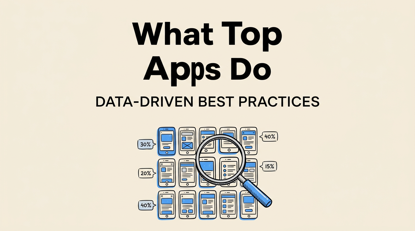
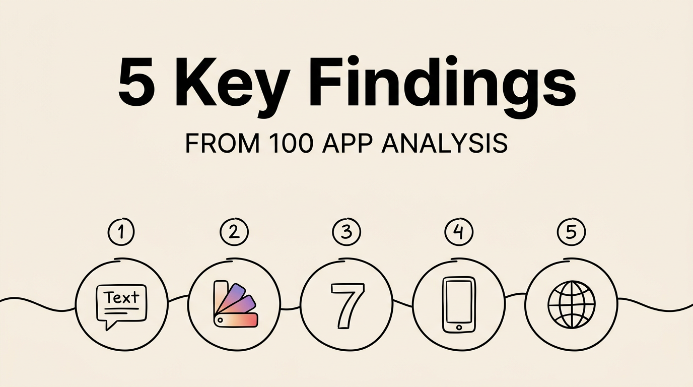
We analyzed the screenshots of the top 100 free and top 100 paid apps on the US App Store. Five patterns stood out:
- 82% use captions on every screenshot
- 67% use gradient backgrounds
- The average app uses 7.2 screenshots
- 54% include device frames
- Only 38% localize beyond English (the biggest missed opportunity)
Here’s what we found and what it means for your app.
How We Collected the Data
We used Screenshot Lab’s competitor research feature to download screenshots and extract captions via Vision OCR across the top 100 free and top 100 paid apps. For each app, we recorded: number of screenshots, caption presence and placement, background style, device frame usage, localization status, and overall visual approach.
Finding 1: 82% Use Captions on Every Screenshot
No surprise here. Captions are everywhere. But the details matter.
Where do captions go?
| Placement | Percentage |
|---|---|
| Top of screenshot | 48% |
| Bottom of screenshot | 22% |
| Overlay on screenshot | 12% |
| No captions at all | 18% |
The 18% without captions are almost exclusively established brands: Instagram, YouTube, Google Maps. Their UI is so recognizable they don’t need text explaining what the app does.
For indie apps? Captions are non-negotiable. They explain what the user is looking at, highlight the benefit, and include keywords that Apple’s OCR indexes for search.
How long are they?
| Word count | Percentage | Example |
|---|---|---|
| 1-3 words | 28% | “Stay Focused” |
| 4-6 words | 47% | “Track Your Progress Daily” |
| 7-10 words | 19% | “See All Your Habits in One View” |
| 11+ words | 6% | Too long. Hard to read at thumbnail. |
4-6 words is the sweet spot. Long enough to communicate a benefit. Short enough to read at scroll speed.
Finding 2: 67% Use Gradient Backgrounds
| Style | Percentage |
|---|---|
| Gradient (two-tone) | 67% |
| Solid color | 14% |
| Image/photo background | 8% |
| White/light gray | 7% |
| Dark/black | 4% |
Gradients win because they add visual depth without competing with the app screenshot. They’re more distinctive than solid white and more flexible than photos.
One trend worth noting: dark backgrounds are growing fast. In Productivity and Finance, 31% of apps now use dark backgrounds, up from about 15% two years ago. Dark mode apps look better on dark backgrounds, and users associate dark UIs with “premium.”
What to avoid: white backgrounds blend with the App Store’s light gray UI. Your screenshots lose visual separation and fade into the page. If you use white, make sure the app screenshot itself provides enough contrast.
Finding 3: Top Apps Use 7.2 Screenshots on Average
Apple allows 10. Most top apps don’t use all of them.
| Count | Percentage |
|---|---|
| 10 (maximum) | 18% |
| 8-9 | 27% |
| 6-7 | 38% |
| 4-5 | 12% |
| 1-3 | 5% |
6-8 is the sweet spot. Enough to tell your story. Not so many that you’re padding with weak content.
Here’s the thing most developers forget: only the first 3 screenshots appear in search results. Those 3 do most of the heavy lifting.
| Position | Estimated view rate |
|---|---|
| #1 | ~95% |
| #2 | ~85% |
| #3 | ~75% |
| #4+ | ~20-40% (requires tapping into your listing) |
Your first 3 screenshots need to be strong enough to make someone tap. Screenshots 4-8 close the deal for users who are already interested.
A good sequence:
- Hook. Your biggest value proposition.
- Core feature. What the app primarily does.
- Differentiator. What makes you different.
- Social proof. Downloads, ratings, press.
- Secondary feature. Another selling point.
- Secondary feature or CTA. Close the deal.
Finding 4: 54% Include Device Frames
Device frames aren’t going away, but they’re not universal anymore either.
| Approach | Percentage |
|---|---|
| Frames on all screenshots | 42% |
| Frames on some screenshots | 12% |
| No frames (floating/full-bleed) | 46% |
It breaks down by category:
| Category | Use device frames |
|---|---|
| Productivity | 71% |
| Finance | 68% |
| Business | 65% |
| Education | 58% |
| Health & Fitness | 52% |
| Social | 41% |
| Photo & Video | 33% |
| Entertainment | 28% |
| Games | 22% |
The pattern: “serious” categories (productivity, finance, business) lean heavily toward frames. Visual categories (photo, games) lean away.
Frame usage is also declining overall. It was about 65% three years ago, now 54%. More apps are moving toward frameless designs that feel more modern and give more visual space to the content.
Finding 5: Only 38% Localize Beyond English
This is the biggest missed opportunity in the entire dataset.
| Localization level | Percentage |
|---|---|
| English only | 62% |
| 2-5 languages | 21% |
| 6-10 languages | 9% |
| 11-20 languages | 5% |
| 21+ languages | 3% |
62% of top apps, including apps earning millions internationally, don’t localize their screenshots beyond English.
But apps with localized screenshots see 25-40% higher conversion rates in non-English markets. Japan, South Korea, Germany, and France are markets where English-only screenshots hurt conversion badly.
Why do developers skip it? Time. Creating screenshots in 10 languages means managing 60-80 image files manually. Translations cost money. Different text lengths require layout adjustments. It’s a lot of work.
Or it used to be. AI-powered localization tools like Screenshot Lab can generate adapted captions for 40+ languages in minutes. Not translations, adaptations, with market-specific keywords. The ROI on localization is one of the highest in ASO.
What to Do With This Data
Starting from scratch?
- 6-8 screenshots with captions on every one
- Gradient background in your brand colors
- 4-6 word captions, benefit-focused — see our design principles guide for more
- Device frames if you’re in productivity, finance, or business
- Localize for at least Japanese, German, French, and Korean if you sell internationally
Optimizing existing screenshots?
- Add captions if you don’t have them. Single biggest improvement you can make.
- Check your first 3. These are what 75-95% of users see.
- Switch to gradient backgrounds if yours are plain white.
- Localize. If you’re English-only and sell internationally, this has the highest ROI of anything on this list.
- Cut weak screenshots. 6 strong screenshots beat 10 mediocre ones.
Questions
How many screenshots do I actually need? 6-8. Average among top apps is 7.2. Don’t pad with weak content just to hit 10. Make sure they’re at the correct pixel sizes.
What’s the most common caption placement? Top (48%). Bottom is second (22%). Both work. Consistency matters more than position.
Should I use dark or light backgrounds? Gradients are the safest bet (67% of top apps). Dark gradients are trending up. Avoid plain white.
Do I need device frames? Check your category. Productivity and finance: yes (65-71% use them). Games and photo apps: probably not (22-33%).
Is localization really worth the effort? 25-40% higher conversion in non-English markets. Only 38% of top apps do it. That’s a big competitive edge for relatively little work with AI tools. Compare your screenshot tool options to find the best fit.
Ideal caption length? 4-6 words. Used by 47% of top apps. Long enough to say something useful. Short enough to read at thumbnail size.