What Makes a Great App Store Screenshot? Design Principles That Convert
7 design principles behind the highest-converting App Store screenshots, based on what the top 100 apps actually do.
Most App Store screenshots are mediocre. They show off features nobody asked about, use captions nobody can read at thumbnail size, and look like they were thrown together the night before submission.
The top-performing apps do things differently. After studying hundreds of them, we found 7 patterns that keep showing up. (For the raw data, see our top 100 analysis.)
1. Lead With Your Biggest Benefit
Your first screenshot has one job: answer “What does this app do for me?”
Not “what features does it have.” Not “how pretty is the UI.” What concrete outcome does the user get?
| App Type | Weak First Screenshot | Strong First Screenshot |
|---|---|---|
| Habit tracker | ”Beautiful Habit Tracking" | "Build Habits That Actually Stick” |
| Budget app | ”Advanced Finance Manager" | "See Where Your Money Goes” |
| Photo editor | ”100+ Filters & Effects" | "Make Every Photo Instagram-Worthy” |
| Fitness app | ”Complete Workout Platform" | "Get Fit in 15 Minutes a Day” |
See the pattern? Strong captions focus on outcomes, not capabilities.
We looked at the first screenshot of 100 top-grossing apps. 78% lead with a benefit-focused caption. Only 7% lead with a feature list, and those were established brands like Google or Meta that don’t need to sell you on what the app does.
If you’re not a household name, lead with benefits. Period.
2. Design for Thumbnail Size
Here’s something most developers miss: your screenshots are never viewed at full size during discovery. In search results, they show up at roughly 40% of their actual dimensions.
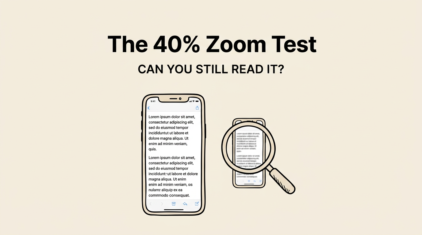
The readability test
Create your screenshot at full size (1260 x 2736 px). Zoom out to 40%. Can you still read the caption? Can you tell what the app does?
If the answer to either question is no, your text is too small or your layout is too busy.
Font size guidelines
| Element | Minimum Size (full res) |
|---|---|
| Main caption | 80px+ |
| Subtitle | 48px+ |
| Body text | Don’t use it. Too small. |
If it’s not readable at 40%, it doesn’t belong in your screenshot. No paragraphs. No small annotations. No feature lists. Bold, high-contrast text only.
3. Treat Your First Screenshot Like a Billboard
People scroll through App Store search results at speed. You have one chance to make them stop.
Billboard rules work here:
- One message. Not three. Not five.
- 7 words or less. That’s the ideal caption length for screenshot #1.
- Maximum contrast. Text must pop against the background instantly.
- Show, don’t tell. The app screenshot should reinforce the caption visually.
Try this: open the App Store, search your main keyword, and scroll at normal speed. Which apps catch your eye? Almost always, they have bold text, a distinctive color, and one clear focal point.
4. Match Your Colors to Category Expectations
Color communicates before text does. Users have subconscious expectations about what colors “feel right” for different categories.
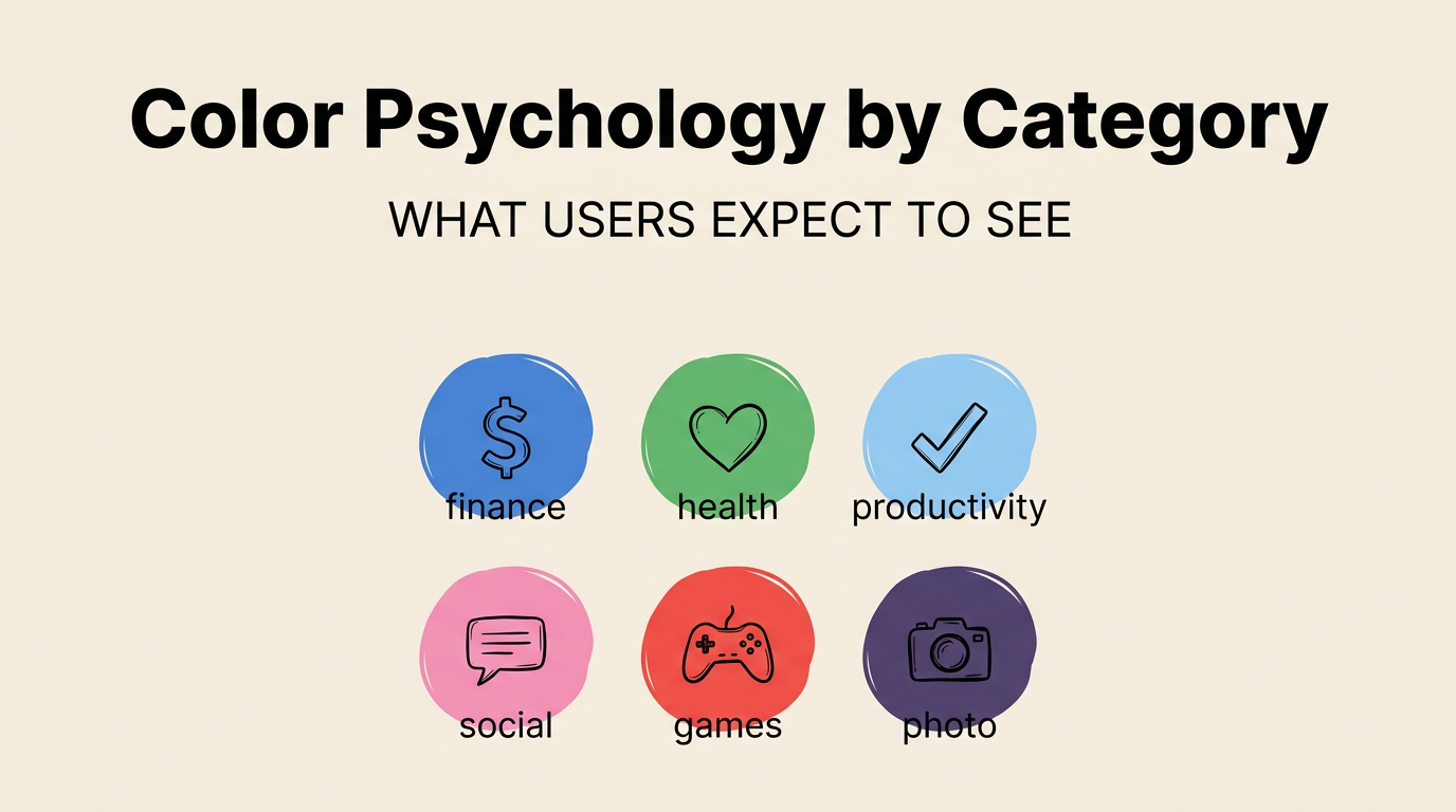
| Category | Dominant Colors | Why |
|---|---|---|
| Finance / Banking | Blue, green, dark tones | Trust, stability |
| Health / Fitness | Green, orange, bright tones | Energy, motivation |
| Productivity | Blue, white, clean pastels | Focus, calm |
| Social / Dating | Pink, purple, warm tones | Connection, emotion |
| Games | Bold primaries, neon | Excitement, fun |
| Photo / Video | Dark backgrounds, gradients | Cinematic, premium |
| Education | Blue, yellow, friendly tones | Knowledge, optimism |
When to follow conventions: When you’re new and need to appear credible. Users should immediately recognize “this is a fitness app” from the colors alone.
When to break them: When every competitor uses blue and you want to stand out. Orange in a sea of blue gets noticed. But be intentional about it.
Background strategy
- Dark backgrounds make the app screenshot pop. Premium feel.
- Light backgrounds are clean but can blend with the white App Store UI.
- Gradients are the most popular choice (67% of top apps). Depth without distraction.
- Solid colors are bold and distinctive.
One thing to watch for: check how your background looks against the App Store’s white page. Your screenshots need visual separation.
5. Be Consistent. No Exceptions.
Every screenshot in your set should feel like part of the same family. Inconsistency signals “thrown together in a hurry” even if individual screenshots look fine on their own.
What must stay the same across all screenshots:
| Element | Rule |
|---|---|
| Font | Same typeface everywhere |
| Caption position | Same placement on every screenshot |
| Color palette | Same background style throughout |
| Device frame | Same frame style (or no frames on all) |
| Text size | Same caption size on every screenshot |
This is the single biggest argument for using templates. A template enforces consistency automatically. Without one, developers inevitably drift: slightly different font sizes, subtly different background shades, mixed frame styles. Each “small” inconsistency adds up.
6. Show Real Content, Not Empty States
Your screenshots should show your app with realistic data. Not “Task 1, Task 2, Task 3.” Not empty dashboards. Not Lorem ipsum.
Why? Because real data builds trust. Users want to see what the app actually looks like when they use it. Fake or placeholder content triggers skepticism.
| App Type | Bad | Good |
|---|---|---|
| Task manager | ”Task 1, Task 2, Task 3" | "Buy groceries, Call dentist, Review PR” |
| Weather app | ”City Name: 72F" | "San Francisco: 72F, partly cloudy” |
| Expense tracker | ”$0.00 balance" | "$2,847.52 balance, 12 transactions” |
| Notes app | Empty note | A note with a paragraph, bullet points, and an image |
Set up a demo account with realistic data. Use your app for a week, or manually create sample data that looks natural. Screenshot the screens where users get value, not settings or onboarding.
7. Optimize Captions for Apple’s OCR
Since 2024, Apple uses OCR to read text in your screenshots and index those words as search keywords. Your captions now directly affect your ranking.
Include target keywords in captions. If you’re targeting “habit tracker,” use “Track Your Daily Habits” instead of “Build Better Routines.” Both say the same thing, but only the first includes the keyword.
Use different keywords per screenshot. Each screenshot can target a different cluster:
- Screenshot 1: “Track Your Daily Habits” (targets: track, daily, habits)
- Screenshot 2: “Smart Reminders That Work” (targets: smart, reminders)
- Screenshot 3: “See Your Streak Grow” (targets: streak)
Six screenshots with different keywords can add 12+ unique terms to your index.
Don’t stuff keywords. “Habit Tracker App for Daily Habit Tracking Habits” is obvious and Apple penalizes it. Write naturally.
Make text OCR-readable. High contrast, clean sans-serif fonts, minimum 48px at export resolution.
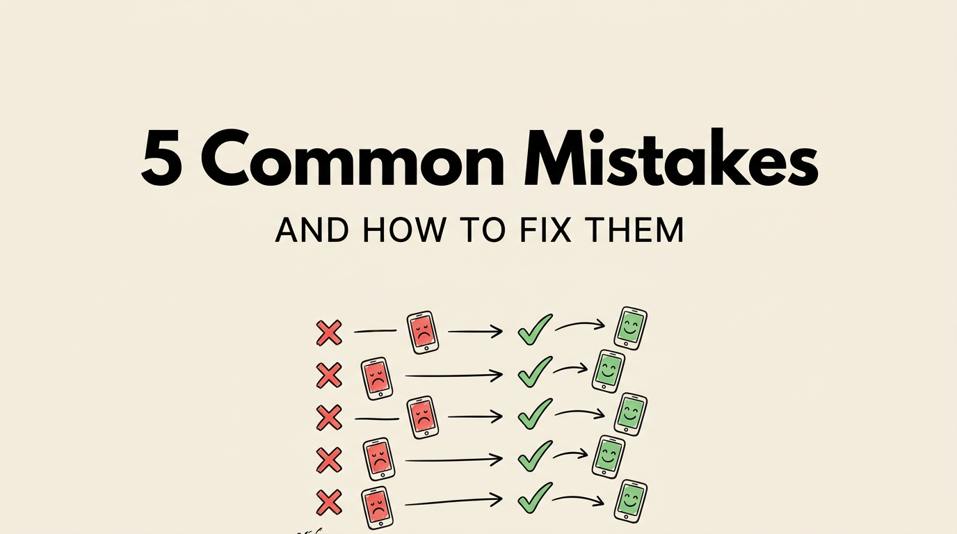
Common Mistakes (and How to Fix Them)
Feature dump on screenshot #1. Listing “100+ Features: Tasks, Calendar, Notes, Reminders…” doesn’t work. One benefit. One sentence. That’s it.
Unreadable text. If your caption has 14 words in a thin font over a gradient, nobody can read it at scroll speed. 4 words, bold font, solid contrast.
Empty or fake data. “Welcome! Your dashboard is empty” doesn’t sell anything. Show the app full of content, mid-use, delivering value.
Inconsistent styles. Dark background on screenshot 1, light on screenshot 2, no caption on screenshot 3. Pick a template. Stick with it.
Leading with the wrong screen. Your settings page is not a hook. Your core feature is. Lead with the screen that makes people think “I need this.”
The Checklist
Before uploading, verify:
Per screenshot:
- Caption is 3-7 words, benefit-focused
- Caption includes at least one target keyword
- Text is readable at 40% zoom
- App shows real, realistic content
- The feature shown matches the caption
Across the full set:
- First screenshot has the strongest hook
- All screenshots use the same template and style
- Each screenshot targets a different keyword
- 6-8 screenshots total
- The set tells a logical story
Questions We Get Asked
Top or bottom captions? Both work. Top captions get read first. Bottom captions let the app screenshot grab attention first. Our analysis shows roughly 60/40 in favor of top. The key is consistency: pick one and stick with it.
Are device frames necessary? Not always. They help for productivity and business apps (71% use them). Photo and game apps lean frameless (67-78%). Check your category.
Best background color? There’s no universal answer, but gradient backgrounds are the safest bet (67% of top apps). Dark gradients give a premium feel. Avoid plain white since it blends with the App Store UI.
How often should I update screenshots? At minimum, when you ship a major feature or redesign. Ideally, refresh quarterly. Regular updates signal to Apple’s algorithm that your app is actively maintained. See our step-by-step creation guide for the fastest workflow.
Do screenshots affect search ranking? Yes, two ways. Apple’s OCR indexes text in screenshots as keywords. And better screenshots improve conversion rate, which is itself a ranking factor.
What resolution should they be? iPhone: 1260 x 2736 px. iPad: 2064 x 2752 px. Export at 1x scale. See our complete size guide.