The Psychology Behind App Store Screenshots: 7 Cognitive Biases That Drive Downloads
7 cognitive biases that influence App Store download decisions, and how to apply each one to your screenshots for higher conversion rates.
Every download decision is an emotional one. Users do not open a spreadsheet, list the pros and cons of your app, and make a rational choice. They glance at your listing, feel something, and decide in seconds.
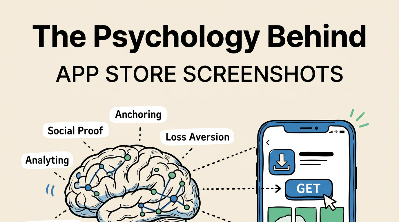
That feeling is shaped by cognitive biases: mental shortcuts the brain uses to make fast decisions. There are dozens of documented biases, but seven of them are directly relevant to how users evaluate App Store screenshots. Understanding these biases will not make your app better, but it will make your screenshots dramatically more effective at converting browsers into downloaders.
Here is each bias, how it works, and exactly how to apply it.
1. Social Proof: “If Others Use It, It Must Be Good”
Social proof is the tendency to assume that the actions of others reflect the correct behavior. When you see a restaurant with a line out the door, your brain says “that place must be good.” The same mechanism operates in the App Store.
How it works in screenshots
When users see evidence that other people use and trust your app, their risk perception drops. The app feels safer to download because the decision has been “pre-validated” by others.
How to apply it
| Social Proof Type | Screenshot Implementation | Impact |
|---|---|---|
| User count | ”Trusted by 2M+ users” in caption | High |
| Rating/reviews | ”4.8 stars, 50K ratings” badge | High |
| Awards | ”App Store Best of 2025” badge | Very High |
| Press mentions | ”Featured in TechCrunch” | Medium |
| Populated UI | Show busy feeds, full calendars, active data | Subtle but effective |
The most subtle form of social proof is simply showing your app populated with data. An empty calendar app looks unused. A calendar with events, colors, and activity looks like something real people rely on.
Where to place it: Social proof is most effective on your first screenshot or as a standalone screenshot early in the sequence (position 2 or 3). Burying it at screenshot 8 wastes its impact.
Important caveat: Your social proof must be real. Fabricating user counts or ratings violates Apple’s guidelines and erodes trust if users investigate. If you do not have strong numbers yet, skip this bias and focus on the others.
2. Anchoring: “The First Thing I See Sets My Expectations”
Anchoring is the brain’s tendency to rely heavily on the first piece of information it encounters. In negotiations, whoever states a number first sets the anchor. In the App Store, your first screenshot sets the anchor for how users evaluate everything else.
How it works in screenshots
If your first screenshot communicates premium quality and clear value, users will evaluate your subsequent screenshots, description, and price through that positive lens. If it looks cheap or confusing, every other element has to fight against that initial anchor.
How to apply it
| First Screenshot Approach | Anchor Set | Downstream Effect |
|---|---|---|
| Bold benefit caption + polished UI | ”Premium, professional app” | Users expect quality, more likely to pay |
| Cluttered feature list | ”Complex, probably hard to use” | Users expect difficulty, less likely to download |
| Minimalist, beautiful design | ”Elegant, thoughtful app” | Users expect attention to detail |
| Generic template look | ”Another commodity app” | Users compare on price, not value |
This is why we recommend treating your first screenshot as the single most important asset in your listing. Get the anchor right, and everything downstream benefits. Our design principles guide covers the specific design elements that set a premium anchor.
3. Loss Aversion: “I Don’t Want to Miss Out”
Humans feel the pain of losing something roughly twice as intensely as the pleasure of gaining something equivalent. This is loss aversion, and it is one of the most powerful motivators in human psychology.
How it works in screenshots
Most screenshot captions focus on what users gain: “Track Your Habits”, “Save Money”, “Get Fit.” These are fine, but they are only half the equation. Loss-framed captions tap into a stronger emotion.
How to apply it
| Gain Frame (Standard) | Loss Frame (Stronger) |
|---|---|
| “Save money every month" | "Stop losing money on hidden fees" |
| "Remember all your tasks" | "Never forget an important deadline" |
| "Track your calories" | "Don’t let bad habits go unnoticed" |
| "Learn a new language" | "Don’t fall behind while others learn" |
| "Organize your photos" | "Stop losing precious memories” |
Loss-framed captions work best when the potential loss is concrete and relatable. “Never miss what matters” is more powerful than “Stay informed” because the reader can immediately imagine the consequence of missing something important.
When not to use it
Loss aversion can feel manipulative if overused or applied to low-stakes situations. “Don’t miss out on our premium filters” feels forced. Reserve loss framing for genuinely meaningful outcomes: missed deadlines, lost money, forgotten memories, wasted time.
4. Mere Exposure Effect: “I’ve Seen This Before, So I Trust It”
People develop a preference for things they encounter repeatedly. This is the mere exposure effect. It explains why brand recognition drives purchasing decisions even when consumers cannot articulate why they prefer one brand over another.
How it works in screenshots
If your screenshots use visual elements that users have already seen and associated with quality, your app feels more trustworthy. This is not about copying competitors. It is about using visual conventions that match user expectations.
How to apply it
| Category Convention | Why It Works |
|---|---|
| Finance apps use dark backgrounds | Users associate dark with “serious money tools” |
| Fitness apps use energetic colors | Users associate bright with “active lifestyle” |
| Productivity apps use clean layouts | Users associate minimal with “organized” |
| Games use cinematic shots | Users associate drama with “high production value” |
Following your category’s visual conventions signals familiarity and competence. Breaking them can work, but only if you break them deliberately and with a clear strategic reason.
This connects to our screenshot examples by category guide, which documents the specific patterns in each App Store category.
5. Choice Overload: “Too Many Options, I’ll Decide Later (Never)”
When presented with too many choices, people often choose nothing at all. This is the paradox of choice or choice overload. It is the reason why restaurants with smaller menus often outperform those with 200 items.
How it works in screenshots
Screenshots that try to show everything create cognitive overload. Multiple feature callouts, annotations, and competing elements give the user’s brain too much to process. The result: they scroll past without engaging.
How to apply it
Rule of one: Each screenshot should communicate exactly one idea. One feature. One benefit. One message.
| Overloaded Screenshot | Focused Screenshot |
|---|---|
| Dashboard + sidebar + modal + 3 callout arrows + 2 badges | Dashboard only, one caption |
| ”Track habits, set goals, view stats, and share progress" | "Build habits that last” |
| 4 different app screens tiled in one image | 1 app screen, full size |
The exception is the panoramic or continuous-scroll style where screenshots flow into each other. This works because the user processes them sequentially (one at a time) rather than simultaneously.
Screenshot count and choice overload
Using all 10 screenshot slots is fine as long as each one has a distinct purpose. The overload happens within individual screenshots, not across them. A focused set of 8 screenshots is better than 4 cluttered ones.
6. Framing Effect: “How You Say It Changes What I Think”
The same information, presented differently, leads to different decisions. Saying “90% success rate” feels better than “10% failure rate” even though they describe identical outcomes. This is the framing effect.
How it works in screenshots
Your screenshot captions frame your app’s capabilities. The frame you choose shapes how users perceive value.
How to apply it
| Neutral Frame | Positive Frame | Impact |
|---|---|---|
| ”Budget tracking tool" | "The simplest way to save money” | Superlative creates preference |
| ”Available in 12 languages" | "Speak your language” | Personal connection |
| ”100+ workout routines" | "A workout for every mood” | Relatability over quantity |
| ”Syncs across all devices" | "Start on iPhone, finish on Mac” | Scenario painting |
| ”Advanced filtering options" | "Find exactly what you need” | Outcome over mechanism |
The best frames turn features into stories. “Syncs across devices” is a feature. “Start on iPhone, finish on Mac” is a micro-story that the user can see themselves living.
Also consider how framing affects your screenshot captions. The same 5-word caption can convert dramatically differently based on the frame.
7. Authority Bias: “Experts Endorse It, So It Must Be Legitimate”
People defer to authority figures and institutions. A recommendation from the New York Times carries more weight than a recommendation from a stranger, even if the stranger has more expertise.
How it works in screenshots
Authority signals in your screenshots reduce perceived risk and increase credibility. They tell users “this app has been vetted by people or institutions you respect.”
How to apply it
| Authority Signal | Where to Place | Impact |
|---|---|---|
| ”Apple Editor’s Choice” | First or second screenshot | Very High |
| ”Featured by Apple” | Badge on any screenshot | High |
| Press logos (NYT, TechCrunch, etc.) | Dedicated screenshot | Medium-High |
| Expert endorsement quote | Caption or overlay | Medium |
| Professional certification | Caption | Medium (for B2B/medical) |
| “Used by teams at [Company]“ | Caption or badge | Medium |
The highest-value authority signal for an App Store app is being featured by Apple. If you have ever been featured, that badge should appear prominently in your screenshots. It is the App Store equivalent of a Michelin star.
Combining Biases for Maximum Impact
The most effective screenshot strategies layer multiple biases together. Here is how a single screenshot can leverage three biases simultaneously:
Example: A fitness app’s first screenshot shows a progress dashboard (social proof via populated data) with the caption “Don’t let another week slip by” (loss aversion) on a dark, energetic gradient that matches category expectations (mere exposure).
Example: A finance app’s first screenshot shows “Trusted by 2M investors” (social proof + authority) with the caption “See where your money really goes” (framing as discovery, not tracking) over a polished, data-rich dashboard (anchoring for premium quality).
| Bias Combination | Best For |
|---|---|
| Social Proof + Authority | Established apps with strong numbers |
| Loss Aversion + Framing | Apps solving painful problems |
| Anchoring + Mere Exposure | New apps entering crowded categories |
| Framing + Choice Reduction | Apps with complex feature sets |
The key is subtlety. Layering biases should feel natural, not manipulative. If your screenshot feels like a sales pitch, you have gone too far.
Measuring Psychological Impact
You cannot directly measure which cognitive bias drove a download. But you can test different bias-driven approaches using Apple’s Product Page Optimization:
- Create a “social proof” variant (user count, ratings, press logos).
- Create a “loss aversion” variant (loss-framed captions).
- Create a “benefit framing” variant (positive outcome captions).
- Test them against each other and your current screenshots.
After 2-4 weeks, you will have data on which psychological approach resonates most with your specific audience. The answer often varies by category and user demographic.
Frequently Asked Questions
Is using cognitive biases in screenshots manipulative? No more than any other form of marketing. These biases are not tricks: they are how human brains naturally process information. Using them effectively means communicating your app’s value in the way users are most likely to understand and appreciate it. Manipulation would be using these techniques to sell something that does not deliver on the promise.
Which bias has the biggest impact on conversion? Social proof, if you have strong numbers. Loss aversion, if you do not. Anchoring (via your first screenshot quality) has the broadest impact because it shapes how users perceive everything else. Start with whichever matches your current situation and check our best practices guide for general patterns.
Do these biases work the same across all cultures? The core biases are universal, but their strength and application vary by culture. Social proof is especially powerful in collectivist cultures (East Asia, Latin America). Authority bias is stronger in high power-distance cultures. If you are localizing for multiple markets, adapt your psychological approach along with your language. See our localization guide.
How many biases should I try to use in one screenshot set? Focus on 2-3 across your entire screenshot sequence, not per screenshot. Most effective approach: one primary bias for screenshots 1-2 (social proof or loss aversion), and a secondary bias woven throughout the rest (framing or mere exposure). Trying to activate all seven in every screenshot will create a cluttered, confusing listing.
Should I use the same psychological approach for both iPhone and iPad screenshots? Generally yes, since the audience psychology is the same. However, iPad users tend to be slightly more productivity-focused and may respond better to authority and framing biases, while iPhone users may respond more to social proof and loss aversion. If you have the resources to differentiate, it is worth testing.