Your First App Store Screenshot Matters More Than the Other 9
Screenshot #1 gets 95% of all views. Here's the psychology, the data, and a formula for making your first screenshot convert.
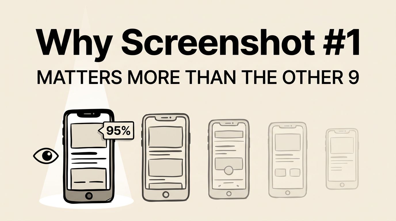
Apple gives you 10 screenshot slots. Most developers treat them as equally important. They are not. Not even close.
Your first screenshot gets seen by virtually every person who encounters your app listing. The second screenshot gets seen by maybe half. By screenshot 5, you are down to 15-20%. By screenshot 10, single digits.
This means your first screenshot carries more weight than the other nine combined. It is your billboard, your elevator pitch, and your first impression rolled into one 1260 x 2736 pixel image.
Here is how to make it count.
The Data: Why Screenshot #1 Gets 95% of Views
There are two main discovery paths in the App Store, and both heavily favor the first screenshot.
Search results
When a user searches for a keyword, apps appear in a vertical list. Each result shows the app icon, name, subtitle, and the first 2-3 screenshots in a horizontal scroll. The first screenshot is fully visible. The second is partially visible. Everything else requires scrolling.
Most users never scroll the screenshot carousel in search results. They either tap the app (going to the full listing) or keep scrolling to the next result. Your first screenshot is the only one they are guaranteed to see.
App page
When a user taps into your full listing, the screenshot gallery appears near the top. The first screenshot is fully visible. The rest require horizontal scrolling.
App Store analytics from multiple developers show a consistent dropoff pattern:
| Screenshot Position | Approximate View Rate |
|---|---|
| #1 | 95-100% |
| #2 | 55-65% |
| #3 | 40-50% |
| #4 | 25-35% |
| #5 | 15-25% |
| #6-10 | 5-15% |
This means optimizing screenshot #1 has roughly 5-10x more impact per unit of effort than optimizing screenshot #7. Yet most developers spend equal time on each, or worse, save their best content for later in the sequence.
The Psychology of First Impressions
The outsized importance of screenshot #1 is not just about visibility. It is about psychology.
The 3-second decision
Users make a snap judgment about your app within 3 seconds of seeing your listing. That judgment is based primarily on three things: your icon, your app name, and your first screenshot. Everything else is supplementary.
This maps to what psychologists call the “thin-slicing” phenomenon: humans make surprisingly accurate judgments based on very thin slices of information. Your first screenshot is the thickest slice of information on your listing.
Anchoring bias
The first piece of information a person receives about something sets the anchor for all subsequent evaluations. If your first screenshot communicates quality, professionalism, and clear value, users will evaluate the rest of your listing through that lens. If it looks amateur or confusing, that impression colors everything that follows.
We cover this and six other cognitive biases in our screenshot psychology guide.
The paradox of choice
With 10 screenshot slots, you might think more is always better. But research on the paradox of choice suggests otherwise. When presented with too many options or too much information, people disengage. A single, powerful screenshot can drive more conversions than 10 mediocre ones.
The Formula for a Winning First Screenshot
After studying hundreds of top-performing app listings, we found that the best first screenshots follow a consistent formula.
Element 1: A clear, benefit-focused caption (3-7 words)
Your caption answers the question: “What does this app do for me?”
| Category | Weak Caption | Strong Caption |
|---|---|---|
| Productivity | ”Advanced Task Management" | "Get More Done, Stress Less” |
| Finance | ”Personal Finance Tracker" | "Know Where Every Dollar Goes” |
| Fitness | ”Complete Workout Platform" | "Get Fit in 15 Minutes a Day” |
| Photo | ”Professional Photo Editor" | "Stunning Photos in One Tap” |
| Education | ”Language Learning App" | "Speak Spanish in 30 Days” |
The strong captions focus on user outcomes. They create a mental image of the benefit. They use specific, concrete language instead of vague descriptors.
Element 2: Your most impressive app screen
Show the screen that best represents your app’s core value. Not your settings page. Not your onboarding. Not a feature that only 10% of users touch. Show the screen that makes someone say “I want that.”
For most apps, this is the main dashboard or the core interaction screen populated with realistic-looking data.
Element 3: Maximum visual contrast
At thumbnail size, your screenshot competes with dozens of others on the same screen. You need instant visual pop. This comes from:
- Bold text against a contrasting background
- Saturated colors that stand out from the App Store’s gray UI
- Clean composition with a single focal point
- Adequate white space so the eye knows where to land
Element 4: One message, not three
The most common mistake with first screenshots is trying to communicate too much. “Track habits AND set goals AND view analytics AND connect with friends.” Pick the single most compelling message and commit to it entirely.
Category-Specific First Screenshot Strategies
Different categories have different expectations. Here is what works best as a first screenshot in the most popular categories.
| Category | First Screenshot Strategy | Why It Works |
|---|---|---|
| Productivity | Main view with sample data | Shows the app solves a real organizational problem |
| Finance | Dashboard with positive numbers | Trust + aspiration in one screen |
| Health & Fitness | Progress or achievement screen | Taps into the user’s desire for improvement |
| Social | Populated feed with engaging content | Shows the platform is active and fun |
| Games | Most visually impressive gameplay | Sells the experience, not the mechanics |
| Photo & Video | Stunning before/after comparison | Demonstrates capability in one glance |
| Education | Progress dashboard or lesson preview | Shows learning is structured and achievable |
| Music | Personalized discovery or playlist | Shows the app understands your taste |
A/B Testing Your First Screenshot
Given how much weight the first screenshot carries, it is the highest-ROI element to test. Apple’s Product Page Optimization feature lets you test up to three screenshot variations against your original.
What to test on screenshot #1:
- Caption variations. Same app screen, different captions. This is the easiest test and often the most impactful.
- Background color. Light vs. dark, different gradient directions, different accent colors.
- With vs. without device frame. Some categories convert better with frames, others without.
- Different app screens. Test which core screen resonates most as the hero image.
What not to test:
- Minor font changes (too subtle to measure)
- Small layout tweaks (not enough impact)
- Multiple changes at once (impossible to isolate the variable)
For the complete testing framework, see our A/B testing guide.
Real-World First Screenshot Patterns
We analyzed the first screenshots of the top 50 free apps on the US App Store. Here is what we found:
| First Screenshot Element | Frequency |
|---|---|
| Benefit-focused caption | 78% |
| App UI as hero element | 84% |
| Gradient background | 62% |
| Device frame present | 48% |
| Social proof element | 22% |
| Dark background | 28% |
| Brand name visible | 36% |
The data is clear: the dominant pattern is a benefit-focused caption over an app UI screenshot, on a gradient background. This pattern works because it simultaneously answers “what does this do?” (the caption) and “what does it look like?” (the UI).
The 22% that include social proof (“Rated #1”, “10M+ users”, “App Store Best of 2025”) tend to be established apps leveraging existing credibility. If you have strong social proof, your first screenshot is the place to use it.
For more context on how category affects these choices, check our 50 screenshot examples by category.
Common First Screenshot Pitfalls
Even developers who understand the importance of screenshot #1 make these errors:
- Leading with a landscape screenshot when most of your screenshots are portrait. The aspect ratio mismatch creates visual inconsistency.
- Showing a feature that requires explanation. If users need context to understand what they are looking at, it is the wrong choice for screenshot #1.
- Using the same screenshot for every device size. What works at iPhone 6.9” dimensions might not work at iPad Pro dimensions. Optimize separately. Use our screenshot size guide for the full spec.
- Matching your competitors exactly. If every app in your category uses a blue gradient with a device frame, doing the same makes you invisible. Follow category conventions for credibility, but find one element to differentiate.
How to Evaluate Your Current First Screenshot
Open the App Store app on your phone. Search for your main keyword. Find your app in the results. Now answer these questions honestly:
- Can you read the caption at the size it appears in search?
- Does the caption communicate a user benefit (not a feature)?
- Does the app screen shown represent your core value?
- Does it stand out from the apps listed above and below it?
- Would someone with no context understand what your app does?
If you answered “no” to any of these, your first screenshot needs work. The good news: fixing screenshot #1 is the single highest-leverage improvement you can make to your App Store listing. Tools like Screenshot Lab can help you create and test variations quickly.
Frequently Asked Questions
Should my first screenshot always have a caption? Yes, unless you are a globally recognized brand (think Instagram, YouTube, Google Maps). For everyone else, captions on the first screenshot are non-negotiable. They communicate your value proposition and include keywords that Apple’s OCR indexes for search.
Is it better to show the app in a device frame or without one? It depends on your category and content. If your app UI is polished and professional, a device frame adds context and credibility. If your content is the selling point (photos, games, social feeds), skip the frame and let the content fill the screen. Our design principles guide has category-specific recommendations.
How do I know if my first screenshot is working? Check your impression-to-product-page conversion rate in App Store Connect. This tells you what percentage of people who see your listing (primarily screenshot #1) tap through to learn more. If this rate is below your category average, screenshot #1 is likely the bottleneck.
Should I use the same first screenshot for all localizations? The app screen can often stay the same, but the caption should be localized, and not just translated. Different markets respond to different value propositions. Our localization guide covers market-specific strategies.
Can I use video as my first asset instead of a screenshot? Apple allows app preview videos, and they auto-play in search results, which grabs attention. However, videos that do not load quickly or do not communicate value in the first 2 seconds can actually hurt conversion. If you use a video, make sure the poster frame (the still image shown before playback) is as strong as a standalone screenshot.