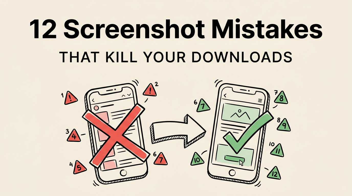
12 App Store Screenshot Mistakes That Kill Your Downloads
The 12 most common App Store screenshot mistakes, why they hurt conversions, and how to fix each one with concrete before/after examples.
Your app might be great. Your screenshots might be killing it before anyone finds out.
We reviewed over 200 App Store listings while building Screenshot Lab and kept seeing the same mistakes repeated across indie apps, small studios, and even well-funded startups. These are not edge cases. They are systematic errors that directly reduce your download conversion rate.
Here are the 12 most damaging mistakes, organized by category, with concrete guidance on how to fix each one.
Design Mistakes
Mistake 1: Text That Disappears at Thumbnail Size
This is the single most common screenshot mistake. Developers design their screenshots at full resolution (1260 x 2736 pixels), add captions that look perfectly fine on their 27-inch monitor, and never check what those captions look like at the size users actually see them.
In App Store search results, screenshots display at roughly 40% of their actual size. On the Today tab or category pages, they are even smaller.
| Element | Minimum Size (Full Res) | Why |
|---|---|---|
| Main caption | 80px+ | Must be readable at 40% zoom |
| Subtitle text | 48px+ | Supporting info, still needs to be legible |
| Body text | Don’t use it | Too small to read at any browse size |
| CTA text | 56px+ | Buttons/badges need to be tappable-looking |
The fix: Design your screenshot, then zoom out to 40% in your design tool. If you cannot read the caption instantly, the font is too small. Our design principles guide covers the full readability framework.
Mistake 2: White Backgrounds That Blend Into the Store
The App Store’s default background is light gray. White screenshot backgrounds merge with it, making your screenshots lose their visual boundary. Your listing looks formless and unfinished.
Bad approach: White background, light gray device frame, no visual separation.
Good approach: Gradient background (even a subtle one) that creates a clear boundary between your screenshot and the store UI. Dark backgrounds are even more effective at creating contrast.
| Background Type | Visual Separation | Recommended |
|---|---|---|
| Pure white (#FFFFFF) | None | Avoid |
| Light gray (#F5F5F5) | Almost none | Avoid |
| Subtle gradient | Good | Yes |
| Bold gradient | Excellent | Yes |
| Dark/black | Maximum | Yes, especially for dark UIs |
Mistake 3: Inconsistent Visual Style Across Screenshots
Screenshot 1 has a blue gradient with a bold sans-serif font. Screenshot 2 switches to a green background with a different font. Screenshot 3 uses a photo background. The result looks like three different apps.
The fix: Pick one background style, one font family, one caption placement, and one color palette. Apply them consistently across every screenshot. Variation should come from the app content shown, not from the frame around it.
Mistake 4: Overcrowded Layouts
Trying to show everything in every screenshot. Multiple UI elements, annotations, callout arrows, badges, and captions all competing for attention. The user’s eye has nowhere to land.
The fix: One message per screenshot. One main UI element. One caption. That is it. If you have six features to highlight, use six screenshots, not one.
Caption Mistakes
Mistake 5: Feature Descriptions Instead of Benefits
This is the difference between “Advanced Task Manager with Tags” and “Get More Done Every Day.” One describes what you built. The other describes what the user gets.
| Feature-Focused (Weak) | Benefit-Focused (Strong) |
|---|---|
| “Smart Notification System" | "Never Miss What Matters" |
| "50+ Customizable Widgets" | "Your Home Screen, Your Way" |
| "AI-Powered Photo Editor" | "Stunning Photos in One Tap" |
| "Cloud Sync Across Devices" | "Your Data, Everywhere" |
| "Detailed Analytics Dashboard" | "See Your Progress at a Glance” |
Users in the App Store are not shopping for features. They are shopping for outcomes. Write captions that describe the outcome. For 50 proven caption examples, see our caption writing guide.
Mistake 6: Too Many Words Per Caption
Anything over 7 words in a screenshot caption starts to lose impact. At thumbnail size, long captions become unreadable blobs of text.
Bad: “Easily Track All Your Daily Habits and Build Lasting Routines” Good: “Build Habits That Stick”
The research from our top 100 apps analysis shows that 47% of top apps use 4-6 word captions. Only 6% use 11+ words.
Mistake 7: Ignoring OCR Keyword Opportunities
Since 2024, Apple reads the text in your screenshots using OCR and indexes those words for search. Every word in your captions is a potential keyword. Most developers waste this opportunity by using generic phrases.
Wasted opportunity: “The Best Way to Stay Organized” Keyword-optimized: “To-Do List and Habit Tracker for Daily Planning”
The second caption includes searchable terms (to-do list, habit tracker, daily planning) that can help your app appear in relevant searches. Read our complete OCR strategy guide for the full framework.
Strategy Mistakes
Mistake 8: Burying Your Best Screenshot
Your first screenshot gets seen by nearly everyone who encounters your listing. Screenshots 5 through 10 might get seen by 10-20% of visitors. Despite this, many developers put their most impressive or differentiated feature on screenshot 4 or later.
The fix: Your best, most compelling, most benefit-clear screenshot goes in position 1. Always. No exceptions. See our deep dive on why your first screenshot matters more than the other nine.
Mistake 9: Showing the Onboarding Flow
Nobody downloads an app because the onboarding looks good. Yet we regularly see screenshots showing welcome screens, sign-up forms, and tutorial overlays. These screens have zero selling power.
What to show instead: The core experience. The screen the user sees after onboarding, when they are actually using the app and getting value from it.
Mistake 10: Not Using All Available Screenshot Slots
Apple gives you up to 10 screenshot slots. Using only 3 or 4 signals that you either do not care enough to fill them or your app does not have enough features worth showing.
| Screenshots Used | Implied Message |
|---|---|
| 1-3 | ”This app is a side project” |
| 4-6 | ”Decent app, limited scope” |
| 7-8 | ”Professional, feature-rich app” |
| 9-10 | ”Comprehensive, premium app” |
The sweet spot for most apps is 7-9 screenshots. Enough to tell a complete story without padding.
Technical Mistakes
Mistake 11: Wrong Screenshot Dimensions
Apple has specific size requirements for each device type. Submitting screenshots at the wrong dimensions means rejection or, worse, automatic scaling that makes everything look blurry.
| Device | Required Size | Display Type |
|---|---|---|
| iPhone 6.9” | 1320 x 2868 px | APP_IPHONE_67 |
| iPhone 6.7” | 1290 x 2796 px | APP_IPHONE_67 |
| iPhone 6.5” | 1284 x 2778 px or 1242 x 2688 px | APP_IPHONE_65 |
| iPad Pro 13” | 2064 x 2752 px | APP_IPAD_PRO_3GEN_129 |
| iPad Pro 11” | 1668 x 2388 px | APP_IPAD_PRO_3GEN_11 |
Use our screenshot size checker tool to verify your dimensions before uploading.
Mistake 12: Compression Artifacts and Low-Resolution App Screenshots
Taking a screenshot on a simulator, scaling it up, or exporting as JPEG instead of PNG introduces visible artifacts. These look especially bad on Retina displays, which is what most App Store browsing happens on.
The fix: Always capture at the highest resolution available. Export as PNG (lossless). Never upscale a screenshot. If your app screenshot is from a smaller device, re-capture on the target device or use a tool that renders at the correct resolution.
The Mistake Severity Matrix
Not all mistakes are equally damaging. Here is how they rank by impact on conversion:
| Mistake | Impact | Difficulty to Fix |
|---|---|---|
| Burying your best screenshot (#8) | Critical | Easy — just reorder |
| Feature captions instead of benefits (#5) | High | Medium — requires rewriting |
| Unreadable text at thumbnail (#1) | High | Medium — resize fonts |
| White backgrounds (#2) | Medium | Easy — change background |
| Too many words (#6) | Medium | Easy — edit down |
| Ignoring OCR keywords (#7) | Medium | Medium — research needed |
| Showing onboarding (#9) | Medium | Easy — swap screenshots |
| Overcrowded layouts (#4) | Medium | Medium — redesign needed |
| Inconsistent style (#3) | Low-Medium | Medium — create a template |
| Too few screenshots (#10) | Low-Medium | Medium — create more |
| Wrong dimensions (#11) | Low (causes rejection) | Easy — resize |
| Compression artifacts (#12) | Low | Easy — re-export |
The first three mistakes on this list can each reduce your conversion rate by 10-30% on their own. Fix those first.
How to Audit Your Own Screenshots
Run through this checklist for your current App Store screenshots:
- Open your listing in the App Store app (not App Store Connect).
- Look at your screenshots at the size they actually appear in search results.
- Can you read every caption? If not, fix the font sizes.
- Does your first screenshot clearly communicate your app’s main benefit? If not, rewrite it.
- Do all screenshots share a consistent visual style? If not, redesign with a unified template.
- Are you using at least 7 screenshots? If not, create more.
- Do your captions include relevant keywords? If not, rewrite them with OCR strategy in mind.
If you want to automate this process, Screenshot Lab includes a competitor research feature that downloads screenshots, extracts captions via OCR, and identifies patterns across top apps in your category. It takes about 30 seconds versus the hours of manual analysis.
Frequently Asked Questions
What is the single worst screenshot mistake I can make? Putting a weak or generic first screenshot. Your first screenshot gets roughly 95% of all views. If it does not immediately communicate your app’s value, nothing else matters. See our first screenshot deep dive for the complete strategy.
How do I know if my screenshots are actually hurting my downloads? Compare your impression-to-download conversion rate in App Store Connect analytics. If you are getting impressions but low conversion (under 5%), your screenshots are likely the bottleneck. Set up a Product Page Optimization test to verify.
Should I hire a designer for my screenshots or use a tool? That depends on your budget and volume. A designer gives you maximum creative control but costs $200-1000+ per set. Tools like Screenshot Lab give you professional results in minutes at a fraction of the cost. For most indie developers, a good tool is the better investment.
How often do top apps update their screenshots? Most top-100 apps update their screenshots at least once per quarter. Major apps like Spotify, Uber, and Instagram update whenever they have a significant feature launch or seasonal campaign. The key is not frequency but intentionality: update when you have something better to show.
Can bad screenshots get my app rejected? Yes, but only for technical reasons: wrong dimensions, misleading content, showing non-app content, or including pricing in the screenshots. The design-level mistakes in this article will not cause rejection. They will just cost you downloads.