Dark Mode App Store Screenshots: Design Guide for Dark UI Apps
Design guide for creating App Store screenshots for dark-themed apps. Contrast, color, background strategies, and category-specific tips.
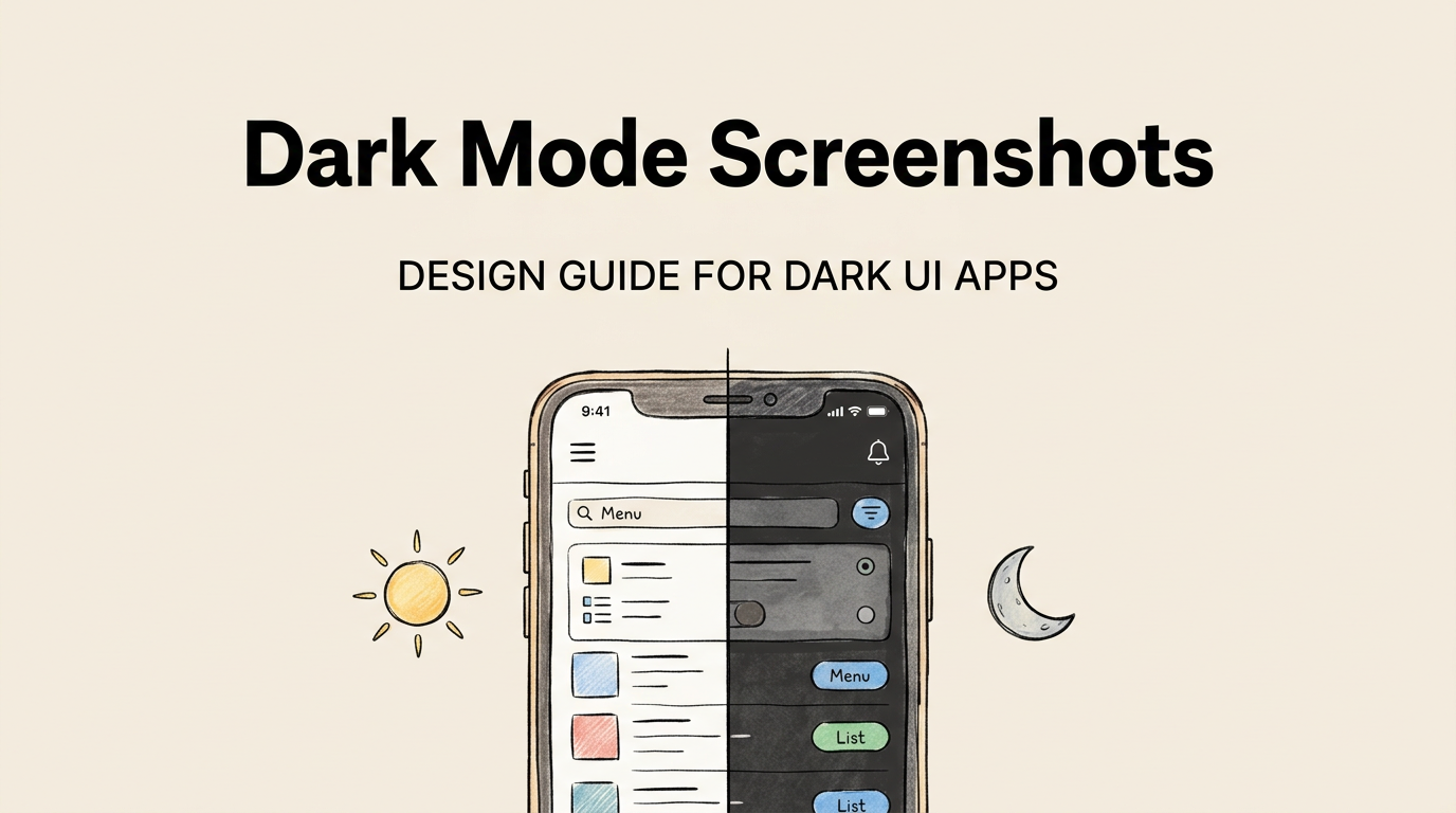
Dark mode has gone from a niche preference to a dominant interface style. Over 80% of iOS users enable dark mode at least part of the time, and many keep it on permanently. The App Store itself looks different in dark mode: the background shifts from light gray to near-black, which changes how your screenshots appear.
If your app uses a dark UI, your screenshots need a deliberate strategy. The rules that work for light-themed apps do not translate directly. Dark backgrounds create different contrast challenges, color perception shifts, and visual hierarchy problems that require specific solutions.
This guide covers everything: why dark screenshots are trending, the design challenges unique to dark UIs, color and contrast guidelines, background strategies, and category-specific recommendations.
Why Dark Screenshots Are Trending
Dark screenshot backgrounds have grown from 15% usage to over 30% across all categories in the past two years. In certain categories, the shift is even more dramatic.
| Category | Dark Background Usage (2024) | Dark Background Usage (2026) | Growth |
|---|---|---|---|
| Finance | 22% | 48% | +26% |
| Productivity | 18% | 42% | +24% |
| Photo & Video | 25% | 45% | +20% |
| Developer Tools | 40% | 65% | +25% |
| Music | 55% | 70% | +15% |
| Games | 60% | 68% | +8% |
| Health & Fitness | 12% | 28% | +16% |
| Social | 15% | 30% | +15% |
Several factors drive this trend:
User preference. Dark mode adoption on iOS has grown steadily. Users who browse the App Store in dark mode see dark-themed screenshots as more natural and cohesive.
Premium perception. Dark interfaces are associated with premium, professional products. Apple’s own marketing for Pro-tier products heavily uses dark imagery. This association transfers to app screenshots.
Visual distinctiveness. On the App Store’s light-mode UI (still the default for screenshot evaluation in most contexts), dark screenshots create strong visual contrast. They stand out against the light gray background.
Practical advantage. Dark screenshots show the user exactly what the app looks like. If your app is dark by default, showing it on a dark background is the most honest representation.
Design Challenges Specific to Dark UIs
Dark screenshots are not just “light screenshots with the colors inverted.” They present unique challenges that require deliberate solutions.
Challenge 1: Low contrast between app UI and background
If your app UI is dark gray (#1a1a2e) and your screenshot background is also dark (#0f172a), the app blends into the background. There is no visual separation, and the screenshot looks like a muddy rectangle.
Solutions:
| Solution | How It Works | When to Use |
|---|---|---|
| Subtle border/glow | Add a 1-2px light border or soft glow around the device/app screenshot | When UI and background are similar darkness |
| Background gradient | Use a gradient that creates lighter areas near the app screenshot | Most situations |
| Elevated device frame | Add a subtle drop shadow to the device frame | When using device frames |
| Accent color bleed | Let your app’s accent color bleed into the background | When your app has a strong accent color |
Challenge 2: Text readability
White text on a dark background is generally readable. But not all dark backgrounds are equally dark, and not all “white” text has enough contrast.
| Text Color | Background | Contrast Ratio | WCAG AA | Readability |
|---|---|---|---|---|
| #FFFFFF on #0f172a | Pure white on dark navy | 16.7:1 | Pass | Excellent |
| #E2E8F0 on #0f172a | Soft white on dark navy | 13.1:1 | Pass | Very good |
| #94A3B8 on #0f172a | Gray on dark navy | 5.8:1 | Pass | Adequate for large text |
| #64748B on #0f172a | Dark gray on dark navy | 3.5:1 | Fail | Too low, avoid |
| #2563EB on #0f172a | Blue on dark navy | 3.2:1 | Fail | Too low for body text |
The critical insight: your brand’s accent color (blue, green, orange) may have excellent contrast on a white background but insufficient contrast on a dark background. Always test color combinations at the actual screenshot dimensions.
For captions specifically, stick to white (#FFFFFF) or near-white (#E2E8F0) text on dark backgrounds. Reserve accent colors for small highlights, badges, or decorative elements where readability is not critical. For more on caption best practices, see our caption examples guide.
Challenge 3: Color accuracy across devices
Dark colors look different on different screens. A subtle dark gradient that looks beautiful on your MacBook Pro may appear as a flat black rectangle on an older iPhone or a washed-out gray on a low-quality external monitor.
Solution: Test your screenshots on multiple devices before uploading. At minimum, view them on an iPhone (the primary browsing device for App Store) and on a Mac (for App Store Connect preview). Make sure subtle gradients are visible on both.
Challenge 4: App Store dark mode vs. light mode
When users browse the App Store in dark mode, the background changes. Your dark screenshots may have less contrast against the dark App Store UI than they would against the light UI.
| App Store Mode | Background Color | Your Dark Screenshot Contrast |
|---|---|---|
| Light mode | Light gray (#F2F2F7) | High contrast (dark on light) |
| Dark mode | Near-black (#1C1C1E) | Low contrast (dark on dark) |
Solution: Choose a dark background color that is not pure black. Navy (#0f172a), dark slate (#1e293b), or dark blue-gray (#1a1a2e) all provide enough differentiation from the App Store’s pure dark mode background while still reading as “dark.”
Color and Contrast Guidelines
Background color recommendations for dark screenshots
| Color | Hex | Works With | Avoid With |
|---|---|---|---|
| Dark navy | #0f172a | Blue, purple, teal accents | Red (too much contrast) |
| Dark slate | #1e293b | Any accent color | Very dark app UIs |
| Dark charcoal | #18181b | White and bright accents | Gray app UIs |
| Dark blue-gray | #1a1a2e | Purple, blue, pink accents | Blue-heavy app UIs |
| Near-black | #0a0a0f | Any bright accent | Low-contrast app UIs |
Accent color selection
Your accent color needs to work harder on dark backgrounds. It serves as the primary visual pop and draws the eye to important elements.
| Accent Color | Hex | Best For | Notes |
|---|---|---|---|
| Electric blue | #2563eb | Tech, productivity, finance | The most popular dark-mode accent |
| Emerald green | #10b981 | Finance, health | Signals growth and positivity |
| Amber | #f59e0b | Alerts, energy, creativity | High contrast, high energy |
| Coral/red | #ef4444 | Social, entertainment | Use sparingly, can feel alarming |
| Purple | #8b5cf6 | Creative, design, premium | Signals creativity and luxury |
| Teal | #14b8a6 | Health, wellness, calm | Approachable and modern |
Use your accent color for:
- Caption text highlights (important words only)
- Background gradient blends
- UI element emphasis within app screenshots
- Decorative elements (lines, shapes, badges)
Do not use your accent color for:
- Full caption text (readability issues)
- Large background areas (overwhelming)
- Multiple competing accent colors (visual chaos)
Background Strategies for Dark Apps
Strategy 1: Matching gradient
Use a gradient that starts with your app’s background color and blends into a slightly lighter or differently-toned shade. This creates a seamless transition between the screenshot background and the app UI.
When to use: When your app has a distinctive dark color scheme that you want to extend to the full screenshot.
Strategy 2: Complementary contrast
Choose a dark background color that is distinctly different from your app’s UI background. For example, if your app uses dark gray, use a dark navy background. The contrast creates clear visual separation.
When to use: When your app’s dark UI is too close to pure black and needs a contrasting frame.
Strategy 3: Accent bleed
Let your app’s accent color softly bleed into the screenshot background as a radial gradient or directional light effect. This creates depth and visual interest while maintaining the dark theme.
When to use: When your app has a strong, distinctive accent color (like Spotify’s green or Robinhood’s green).
Strategy 4: Subtle texture
Add a very subtle texture or pattern (noise, mesh gradient, soft geometric shapes) to the dark background. This prevents the “flat black rectangle” problem and adds visual sophistication.
When to use: When your app’s brand identity includes textured or layered design elements.
| Strategy | Complexity | Visual Impact | Best For |
|---|---|---|---|
| Matching gradient | Low | Cohesive, clean | Most apps |
| Complementary contrast | Low | Clear separation | Very dark UIs |
| Accent bleed | Medium | Dynamic, branded | Apps with strong accent colors |
| Subtle texture | Medium | Sophisticated, premium | Premium/pro-tier apps |
Category-Specific Dark Screenshot Guidelines
Finance
Dark screenshots are nearly the default in finance. Use dark navy or slate backgrounds with green or blue accents. Show charts and data with bright data points against the dark background. Financial data looks more professional and trustworthy on dark backgrounds.
Productivity
Split between dark and light. If your app offers both modes, show the mode your target users are most likely to use. Developer-focused productivity tools should always show dark mode. General productivity apps can go either way. Check our screenshot examples by category for specific patterns.
Photo and Video
Dark backgrounds are excellent for photo apps because they do not compete with the photos being displayed. Your user’s content becomes the visual hero. Black or near-black backgrounds let images pop. Use thin white or accent-colored borders around photos for separation.
Music
Dark is the default for music apps. Concert-venue aesthetics (dark with dramatic accent lighting) work well. Album art should be the visual centerpiece of each screenshot. See how top apps handle this in our best practices analysis.
Health and Fitness
Dark backgrounds are growing but still in the minority. They work well for sleep-tracking apps, meditation apps, and apps positioned as “professional” fitness tools. Bright, energetic fitness apps should stick with light or colorful backgrounds.
Dark Mode Screenshot Checklist
Before uploading your dark-mode screenshots, verify each item:
| Check | Requirement |
|---|---|
| Caption contrast ratio | 4.5:1 minimum (7:1 recommended) |
| App UI visible against background | Clear boundary or frame |
| Accent color readable | Not too dark against background |
| Tested in App Store light mode | Screenshots stand out against light gray |
| Tested in App Store dark mode | Screenshots distinguishable from near-black |
| No pure black background | Use dark navy, slate, or charcoal instead |
| Gradient visible on multiple devices | Subtle gradients render on all screen qualities |
| Screenshot dimensions correct | Use our size checker |
Device Frames on Dark Backgrounds
Device frames interact differently with dark backgrounds than light ones.
| Frame Style | On Dark Background | Recommendation |
|---|---|---|
| Black device frame | Disappears into background | Avoid or add subtle glow |
| Silver device frame | Strong contrast, looks professional | Good choice |
| No frame | Clean, modern, maximum app visibility | Best choice for most dark screenshots |
| Thin white outline | Clear separation without heavy frame | Good alternative to full frame |
For dark-themed screenshots, “no frame” or “thin outline” tends to work best. Full device frames in dark colors vanish against dark backgrounds, defeating their purpose.
Tools for Dark Screenshot Design
| Tool | Dark Mode Support | Gradient Quality | Shadow Control |
|---|---|---|---|
| Figma | Excellent | Excellent | Excellent |
| Sketch | Good | Good | Good |
| Screenshot Lab | Good (dark templates) | Auto-generated | Automatic |
| Canva | Decent | Limited gradient control | Limited |
If you are using Screenshot Lab, select one of the dark templates (BoldDark or similar) and customize the accent colors to match your app’s brand. Our design principles guide covers the general layout principles that apply regardless of light or dark theme.
Frequently Asked Questions
Should I create separate screenshots for light mode and dark mode users? Apple does not serve different screenshots based on the user’s system appearance setting. Every user sees the same screenshots regardless of whether they browse in light or dark mode. Choose the mode that best represents your app and design your screenshots for maximum contrast in both App Store appearances.
Does a dark screenshot background affect my ASO or search ranking? No. Your screenshot background color has zero impact on search ranking. The only screenshot elements that affect ASO are the text captions, which Apple indexes via OCR. A dark background with white text is just as OCR-readable as a light background with dark text. See our OCR strategy guide for details.
My app supports both light and dark mode. Which should I show in screenshots? Show the mode that your target users are most likely to use. If you are unsure, check your analytics for light/dark mode usage. If it is roughly equal, dark mode is currently the trendier choice and may give a slight premium perception lift. You can also show dark mode in the first few screenshots and light mode in later ones to demonstrate flexibility.
Are dark screenshots harder to design well? Somewhat. Dark screenshots have a narrower margin of error. A slightly wrong shade of gray becomes invisible instead of just looking slightly off. Contrast issues are more noticeable. And the “flat black rectangle” problem has no equivalent in light-mode design. However, with the guidelines in this article and a good template, the challenges are manageable.
Do dark screenshots perform better than light ones? Not universally. In categories where dark is the convention (Finance, Music, Developer Tools), dark screenshots perform well because they match user expectations. In categories where bright colors dominate (Kids, Health, Education), dark screenshots may feel out of place. Test both approaches using Apple’s Product Page Optimization to see what works for your specific audience.