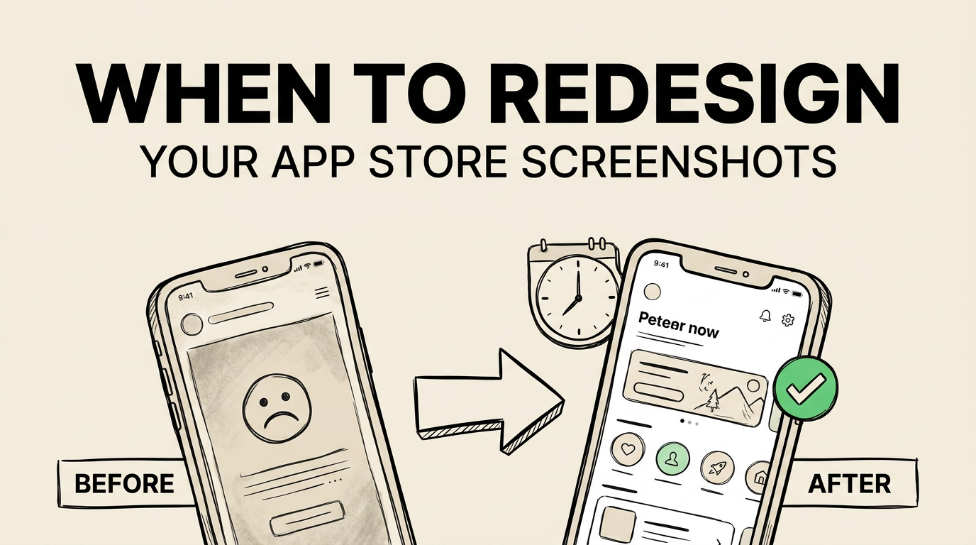
When to Redesign Your App Store Screenshots (And How to Do It Right)
A step-by-step guide to redesigning App Store screenshots without losing rankings. Signs you need a refresh, the redesign process, and how to measure impact.
Your screenshots looked great when you launched. Six months later, your category has evolved, your app has new features, competitors have stepped up their game, and your conversion rate is quietly declining.
Most developers know they should update their screenshots. Few know when to do it, how to do it without risking their existing rankings, or how to measure whether the redesign actually worked.
This guide answers all three questions. We will cover the warning signs that trigger a redesign, the step-by-step process for executing one, and the measurement framework for proving ROI.
7 Signs You Need a Screenshot Redesign
Not every decline in downloads means your screenshots are the problem. But these seven signals are strong indicators that your screenshots have become a conversion bottleneck.
Sign 1: Your conversion rate has dropped without explanation
If your impression count is stable but your download rate is declining, your listing is the likely culprit. Screenshots are the most visible element, making them the first thing to investigate.
Check App Store Connect analytics for the trend:
| Metric | Healthy Range | Warning Zone |
|---|---|---|
| Impression-to-page conversion | 5-15% | Below 3% |
| Page-to-download conversion | 30-60% | Below 20% |
| Month-over-month trend | Stable or growing | Declining 3+ months |
Sign 2: Your competitors have refreshed their screenshots
Open the App Store, search your primary keyword, and look at the listings around yours. If your competitors have visibly upgraded their screenshots and yours look dated by comparison, you are losing relative attractiveness.
Sign 3: Your app UI has changed significantly
If your app looks different now than it did in your screenshots, users experience a disconnect between what they expected (screenshots) and what they get (actual app). This disconnect increases uninstall rates and negative reviews.
Sign 4: You are not using all available screenshot slots
If you launched with 4-5 screenshots and never added more, you are leaving persuasion space on the table. Top apps use 7-9 screenshots on average. See our best practices data.
Sign 5: Your captions are feature-focused, not benefit-focused
Screenshot caption best practices have shifted heavily toward benefit-focused language. If your captions describe what your app does rather than what the user gets, they are underperforming. Check our caption examples guide for the modern standard.
Sign 6: You are not optimizing for Apple’s OCR
Since Apple started indexing screenshot text for search, captions that do not include relevant keywords are a missed SEO opportunity. If your captions were written before OCR indexing became standard practice, they need updating. See our OCR strategy guide.
Sign 7: Your screenshots do not match current design trends
App Store visual trends shift every 1-2 years. Right now, the trends are: dark backgrounds, bold sans-serif typography, minimal device frames, and gradient accents. If your screenshots use white backgrounds, serif fonts, and thick device bezels, they read as dated.
| Trend | Current (2025-2026) | Dated |
|---|---|---|
| Background | Dark gradients, deep colors | White, light gray |
| Typography | Bold sans-serif, 80px+ | Thin or serif fonts, small text |
| Device frames | Thin or none | Thick bezels, old device models |
| Layout | Full-bleed, minimal chrome | Heavy borders, multiple panels |
| Captions | Benefit-focused, 3-6 words | Feature-focused, 8+ words |
If three or more of these signs apply to you, it is time for a redesign.
The Redesign Process: Step by Step
Step 1: Benchmark your current performance
Before changing anything, document your current metrics. You need a baseline to measure improvement against.
Record these from App Store Connect:
- Impression count (last 30 days)
- Product page views (last 30 days)
- Download count (last 30 days)
- Impression-to-page conversion rate
- Page-to-download conversion rate
Also take screenshots of your current listing at browse size (how it appears in search results) for before/after comparison.
Step 2: Research your competition
Download and analyze the screenshots of the top 10 apps in your category. Document:
| Element | What to Record |
|---|---|
| Background style | Color, gradient, light/dark |
| Caption approach | Benefit vs. feature, word count, placement |
| Device frames | Present or absent, frame style |
| Screenshot count | How many each competitor uses |
| Visual quality | Professional, template-based, or amateur |
| Unique differentiators | What makes each stand out |
Screenshot Lab automates this research with competitor screenshot download, OCR caption extraction, and color analysis. Manually, this step takes 2-3 hours. With a tool, about 10 minutes.
Step 3: Define your new strategy
Based on your research, decide on:
- Visual style: Background colors, gradient direction, device frame usage
- Caption strategy: Benefit-focused language, keyword integration for OCR, word count target
- Screenshot sequence: Which features/benefits to highlight and in what order
- Differentiation: What one visual or strategic element will set you apart
Step 4: Create your new screenshots
Build your screenshots using a consistent template. Every screenshot should share:
- Same background style
- Same font family and caption placement
- Same device frame treatment (or lack thereof)
- Consistent brand colors
Use a tool that allows rapid iteration. You will go through multiple drafts. Our creation guide walks through the full production process, and our templates guide covers the most effective template styles.
Step 5: Test before committing
Do not replace your live screenshots with untested new ones. Use Apple’s Product Page Optimization to A/B test your redesigned screenshots against your current ones.
| Approach | Risk Level | Data Quality |
|---|---|---|
| Replace all screenshots at once | High | No comparison data |
| A/B test new vs. old | Low | Clear conversion comparison |
| Gradual rollout (test, then apply) | Lowest | Best data, takes longer |
The A/B test approach is strongly recommended. Even if you are confident your new screenshots are better, test them. Confidence is not data. Our A/B testing guide has the full framework.
Step 6: Measure and iterate
After your test concludes (minimum 14 days, ideally 21-28), analyze the results:
- If the new screenshots win: apply them as your default and plan your next test.
- If it is inconclusive: run for another 2 weeks or test a different variant.
- If the old screenshots win: analyze why and redesign with new hypotheses.
Preserving Rankings During a Redesign
One of the biggest fears around screenshot redesigns is losing search rankings. Here is how to avoid that.
Screenshot changes do not directly affect keyword rankings
Your keyword rankings are determined by your app name, subtitle, keyword field, and (to a lesser degree) your caption text via OCR. Changing your screenshot visuals does not change your keywords.
However, if your new captions use different words, you might shift which keywords you rank for. This is usually a positive change if you are intentionally targeting higher-value keywords, but be aware of it.
Preserve high-value caption keywords
If your current captions include keywords you rank well for, keep those keywords in your new captions. Rephrase them, put them in a new context, but do not remove them entirely.
| Current Caption | Safe Redesign | Risky Redesign |
|---|---|---|
| ”Habit Tracker and Daily Planner" | "Build Daily Habits, Plan Your Week" | "Live Your Best Life" |
| "Budget App for Saving Money" | "Save Money Without the Stress" | "Take Control Today" |
| "Photo Editor With 100+ Filters" | "100+ Filters, Stunning Photos" | "Unleash Your Creativity” |
The “safe redesign” column preserves the core keywords while improving the benefit framing. The “risky redesign” column drops all keywords in favor of pure marketing language.
Time your redesign strategically
Avoid redesigning during:
- Major promotional events (holiday season, back-to-school)
- App Store algorithm changes (watch ASO community signals)
- Right after a price change or major update (too many variables)
The best time for a redesign is during a stable traffic period so you can cleanly measure the impact.
Measuring Redesign Impact
After implementing your new screenshots, track these metrics weekly for at least 6 weeks.
| Metric | Where to Find | What to Look For |
|---|---|---|
| Conversion rate | App Store Connect | 5-30% improvement is typical for successful redesign |
| Impressions | App Store Connect | Should remain stable (screenshots don’t affect discovery) |
| Downloads | App Store Connect | Should increase proportionally to conversion improvement |
| Keyword rankings | ASO tool of choice | Monitor for any shifts, positive or negative |
| Review sentiment | App Store reviews | Watch for “misleading screenshots” feedback |
Expected timeline for results
| Week | What to Expect |
|---|---|
| 1 | Data is noisy. Do not draw conclusions. |
| 2 | Trends begin to emerge. |
| 3-4 | Reliable data. Compare to benchmark. |
| 5-6 | Stable enough for final assessment. |
If after 6 weeks your conversion rate has not changed, the redesign was not impactful enough. Go back to step 3 and try a bolder approach.
Case Study Approach: Before and After
We cannot share specific client data, but here is the pattern we see repeatedly when developers follow this redesign process.
Typical “Before” state:
- White or light backgrounds
- Feature-focused captions (“Advanced sync,” “Smart filters”)
- 4-5 screenshots
- Inconsistent visual style
- No OCR keyword optimization
- Conversion rate: 2-4%
Typical “After” state:
- Dark gradient or bold color backgrounds
- Benefit-focused captions with keyword integration
- 8-9 screenshots
- Unified visual template
- OCR-optimized captions
- Conversion rate: 6-12%
The most common improvements come from three changes: better first screenshot (anchoring), benefit-focused captions (framing), and visual consistency (professionalism signal). These three changes alone account for 60-70% of typical conversion improvements.
When NOT to Redesign
A redesign is not always the answer. Here are situations where your time is better spent elsewhere:
- Your conversion rate is already above category average. If you are converting at 10%+ in a category where 5% is typical, your screenshots are not the bottleneck. Focus on acquisition (getting more impressions).
- You have fewer than 500 impressions per month. With low traffic, you cannot reliably measure the impact of screenshot changes. Focus on ASO and marketing to increase visibility first.
- You just launched. Give your current screenshots at least 4-6 weeks of data before deciding they need replacing. Initial conversion rates often stabilize as your user base and reviews grow.
- The problem is your app, not your screenshots. If users download but quickly uninstall, or if reviews are consistently negative, improving screenshots will only bring more people to a product that disappoints them. Fix the product first.
Frequently Asked Questions
How much does a professional screenshot redesign cost? A freelance designer typically charges $300-1,500 for a complete screenshot set. Agencies charge $2,000-10,000+. Using a tool like Screenshot Lab or other screenshot tools ranges from free to $10-30/month, with the tradeoff being that you do the design work yourself (with templates and AI assistance).
How often should I redesign my screenshots? At minimum, once per year or whenever your app UI changes significantly. Ideally, you should be running A/B tests continuously, which naturally leads to iterative improvements rather than periodic overhauls. The top-performing apps test and refine their screenshots quarterly.
Should I redesign screenshots for all device sizes at once? Yes. Inconsistency across device sizes looks unprofessional and can confuse users who browse on multiple devices. When you redesign, update iPhone 6.9”, iPhone 6.5”, and iPad screenshots simultaneously. Use our screenshot sizes guide for the exact dimensions.
Can I reuse my old screenshots if the new ones perform worse? Yes. Keep your original screenshot files saved. If your A/B test shows the new screenshots underperform, simply revert to the originals. This is another reason to always test before fully committing to a redesign.
Will changing my screenshots reset my App Store reviews or ratings? No. Screenshot changes are a metadata update and have no effect on your existing reviews, ratings, or download history. Your review score and count remain exactly as they were.