App Store Listing Optimization: Every Element That Affects Downloads
A comprehensive guide to every element of your App Store listing, how much each one affects downloads, and how to optimize them all.
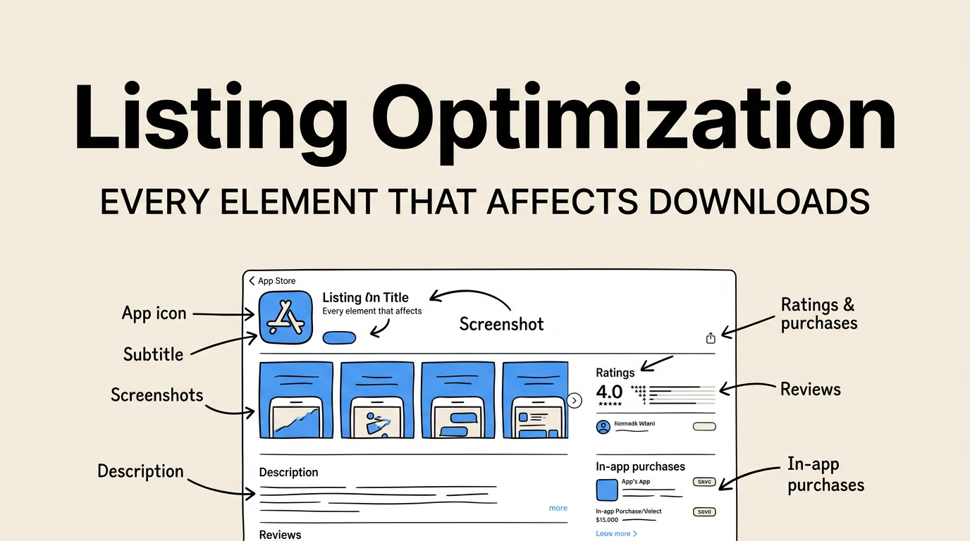
Your App Store listing is a system. Every element works together to convert a browser into a downloader. Most developers optimize one or two elements (usually the icon and maybe screenshots) and ignore the rest. That is like renovating the front door of a house while the roof is leaking.
Apple gives you a dozen different fields and assets to work with, and each one influences user decisions differently. Some affect search visibility. Some affect conversion rate. Some affect both. Understanding the weight and role of each element lets you prioritize your optimization effort where it matters most.
This guide covers every element of your App Store listing, ranks them by impact, and gives you specific optimization advice for each one. Whether you are launching a new app or trying to improve an existing one, this is the complete reference.
The Elements, Ranked by Impact
Not every listing element carries the same weight. Here is a data-driven ranking based on their combined effect on search visibility and conversion rate:
| Rank | Element | Search Impact | Conversion Impact | Overall Weight |
|---|---|---|---|---|
| 1 | App icon | None | Very High | Very High |
| 2 | First screenshot | None (unless OCR indexed) | Very High | Very High |
| 3 | App title | Very High | High | Very High |
| 4 | Subtitle | High | High | High |
| 5 | Keyword field | Very High | None (invisible) | High |
| 6 | Screenshots (all) | Low (via OCR) | High | High |
| 7 | Ratings and reviews | Medium | Very High | High |
| 8 | Description | Low | Medium | Medium |
| 9 | App preview video | None | Medium-High | Medium |
| 10 | What’s New | None | Low-Medium | Low-Medium |
| 11 | In-app purchases display | Low | Low | Low |
| 12 | Developer name | Low | Low | Low |
The top four elements (icon, first screenshot, title, subtitle) account for roughly 80% of your conversion impact. Optimize those first.
App Icon: The First Impression
Your icon is the only element that appears everywhere: search results, charts, the home screen, notifications, and settings. It is also the smallest canvas you have to work with, so every pixel matters.
What Makes a Great App Icon
- Simple silhouette. The best icons are recognizable at 29x29 points. If your icon is illegible at thumbnail size, it fails.
- Limited color palette. Use 2-3 colors maximum. Gradients work well but keep them subtle.
- No text. Text in an icon is unreadable at small sizes. Use a symbol or glyph instead.
- Distinct shape. Your icon should not look like any of the top 10 apps in your category when viewed side by side.
Icon Optimization Checklist
| Check | Why It Matters |
|---|---|
| Recognizable at 16x16pt | Appears this small in some system UI |
| Looks good on light and dark backgrounds | iOS supports both |
| No thin lines or fine details | Get lost at small sizes |
| Distinct from top 10 competitors | Users need to tell icons apart |
| Consistent with your brand | Builds recognition over time |
App Title: Your Most Powerful Keyword Tool
Your title can be up to 30 characters. Those 30 characters carry the most keyword weight of any field in your listing. The App Store algorithm treats title keywords as the strongest signal for search relevance.
Title Structure
The optimal structure is: Brand Name — Primary Keyword
Examples:
- “Headspace: Meditation & Sleep”
- “Notion — Notes, Docs, Tasks”
- “Screenshot Lab — App Screenshots”
The dash or colon separates your brand from your keyword, keeping it natural while maximizing search value.
Title Mistakes to Avoid
- Using all 30 characters for your brand name alone (wastes keyword space)
- Stuffing multiple keywords without natural language (“Photo Edit Collage Filter Cam”)
- Using generic terms like “Best” or “Free” (Apple may reject these)
- Changing your title frequently (can temporarily affect rankings)
For detailed keyword research methodology, see the keyword research guide.
Subtitle: The Conversion and Search Hybrid
The subtitle appears directly below your title in search results and on your product page. It is 30 characters and carries the second-highest keyword weight after the title.
Subtitle Best Practices
Your subtitle should:
- Include your second-most-important keyword that does not fit in the title
- Communicate your primary value proposition
- Be readable as a natural phrase
| Subtitle Approach | Example | Effectiveness |
|---|---|---|
| Benefit-focused | ”Sleep Better Tonight” | High conversion |
| Feature-focused | ”AI Photo Enhancement” | Medium conversion, good search |
| Category descriptor | ”Meditation & Mindfulness” | Good search, low differentiation |
| Social proof | ”Used by 1M+ People” | High conversion, no search value |
The best subtitles combine a benefit with a keyword: “Create App Store Screenshots” tells users what the app does while targeting a valuable search term.
Keyword Field: The Hidden Search Engine
You get 100 characters in the keyword field (visible only to you, not users). This field is your secondary search engine optimization tool after the title and subtitle.
Keyword Field Rules
- Separate keywords with commas, no spaces
- Do not repeat words already in your title or subtitle
- Do not include your app name or developer name
- Do not use plurals (Apple handles this automatically)
- Do not include the word “app”
- Use singular forms only
Keyword Research Process
- Brainstorm 50-100 relevant keywords
- Check their search volume using Apple Search Ads or ASO tools
- Assess competition for each keyword
- Select keywords that balance volume and competition
- Fit them into 100 characters, prioritizing highest-value terms
See the complete keyword research methodology and the metadata optimization guide for detailed walkthroughs.
Screenshots: Your Visual Sales Pitch
Screenshots are the most visually dominant element of your listing. In search results, the first 1-3 screenshots are visible without tapping. On your product page, all screenshots are displayed in a scrollable gallery.
The Screenshot Hierarchy
| Position | View Rate | Purpose |
|---|---|---|
| Screenshot 1 | 100% | Hook — your headline value proposition |
| Screenshot 2 | 70-85% | Primary feature #1 |
| Screenshot 3 | 50-70% | Primary feature #2 |
| Screenshots 4-6 | 30-50% | Supporting features |
| Screenshots 7-10 | 15-30% | Social proof, edge cases, completeness |
Your first screenshot gets all the attention. It needs to communicate your app’s primary value in under two seconds.
Screenshot Design Principles
Follow the screenshot design principles that top apps use:
- Use captions. 82% of top-100 apps use text captions on every screenshot. Captions explain the benefit, not the feature.
- Show real UI. Users want to see what the app actually looks like, not abstract mockups.
- Maintain consistency. Use the same color scheme, typography, and layout across all screenshots.
- Include keywords in captions. Apple’s OCR reads text in your screenshots and may use it for search ranking. See the OCR strategy guide.
Use Screenshot Lab to create professional screenshots with device frames, gradient backgrounds, and keyword-rich captions. The tool handles all required screenshot sizes automatically.
Ratings and Reviews: Social Proof Engine
Ratings are displayed prominently on your product page and in search results. They are one of the strongest conversion factors because they represent the opinion of other users, not your own marketing.
The Numbers That Matter
| Metric | Impact | Target |
|---|---|---|
| Average rating | Very High on conversion | 4.5+ stars |
| Number of ratings | High on conversion and search | 50+ for credibility |
| Recent ratings trend | Medium on algorithm | Improving or stable |
| Written reviews | Medium on conversion | Positive, detailed reviews visible |
| Developer response to reviews | Low-Medium on conversion | Respond to all negative reviews |
How to Get More Ratings
Use SKStoreReviewController.requestReview() at the right moments:
- After a successful task completion
- After the 3rd or 5th session (committed users)
- After a positive in-app event (achievement, milestone)
- Never on first launch, after a crash, or during a complex task
Apple limits the review prompt to 3 times per 365-day period, so timing matters.
For a complete ratings strategy, see the ratings and reviews strategy guide.
Description: The Underused Opportunity
The App Store description can be up to 4,000 characters. Most users do not read it, but those who do are on the fence about downloading. A good description pushes them over.
Description Structure
| Section | Purpose | Length |
|---|---|---|
| First 2-3 lines | Hook — visible without tapping “more” | 170 characters |
| Key features | Bullet points of top 5-7 features | 500-800 characters |
| Social proof | Press quotes, download counts, awards | 200-300 characters |
| Detailed features | Comprehensive feature list | 500-1,000 characters |
| Subscription info (if applicable) | Pricing, terms, privacy link | 300-500 characters |
The first 2-3 lines are critical because they are visible without expanding. Front-load your strongest value proposition and a call to action.
Description Keywords
Apple has stated that the description field does not directly affect keyword ranking. However, it may influence the algorithm indirectly through relevance signals. Write naturally, include relevant terms, but do not keyword-stuff your description.
App Preview Video: Show, Do Not Tell
An app preview video auto-plays (muted) in search results on Wi-Fi and on your product page. It can be up to 30 seconds and should demonstrate your app’s core functionality.
When Video Helps
- Apps with complex interactions that are hard to convey in screenshots
- Games (gameplay footage is expected)
- Apps with beautiful animations or visual effects
- Apps where “seeing it in action” dramatically increases perceived value
When Video Hurts
- If the video quality is low (pixelated, choppy, or poorly edited)
- If the video does not show the app (just animations or text)
- If the first frame is unappealing (it is the thumbnail)
- If the app’s UI is simple enough that screenshots explain it fully
For a detailed comparison, read our analysis of screenshots vs app preview video.
What’s New: The Retention Signal
The “What’s New” section appears on your product page for users who have your app installed. It is a retention tool, not an acquisition tool.
Write genuine, specific update notes. “Bug fixes and performance improvements” is a wasted opportunity. Tell users what you actually changed:
- “New dark mode support with three theme options”
- “Added export to PDF and sharing via iMessage”
- “Fixed the crash that occurred when opening large files”
Specific update notes signal active development, which builds trust with potential new users who scroll down to check.
The Complete Optimization Checklist
Use this checklist to audit your listing systematically. Check each element against the recommendations above:
| Element | Optimized? | Notes |
|---|---|---|
| Icon — Simple, recognizable, distinct | ||
| Title — Brand + primary keyword | ||
| Subtitle — Value prop + secondary keyword | ||
| Keywords — 100 chars, no duplicates | ||
| Screenshot 1 — Strong hook, clear value | ||
| Screenshots 2-6 — Key features, consistent design | ||
| Ratings — 4.5+ average, 50+ count | ||
| Description — Hook in first 3 lines, bullet features | ||
| Preview video — If applicable, high quality | ||
| What’s New — Specific, genuine update notes | ||
| Privacy labels — Accurate, complete | ||
| Support/Privacy URLs — Live, accessible |
For the full optimization process, follow the App Store listing optimization checklist and reference the ASO complete guide for the strategic framework.
Common Optimization Mistakes by Element
Every element has its own set of common mistakes. Here are the ones we see most often:
| Element | Common Mistake | Fix |
|---|---|---|
| Icon | Too much detail, unreadable small | Simplify to 1-2 recognizable shapes |
| Title | All brand, no keywords | Add primary keyword after brand name |
| Subtitle | Tagline with no search value | Include a relevant keyword naturally |
| Keywords | Repeating title/subtitle words | Use unique terms only |
| Screenshots | Raw app captures, no captions | Use templates with captions |
| Ratings | Not asking for reviews | Implement SKStoreReviewController |
| Description | Wall of text, no structure | Use bullet points and short paragraphs |
| Video | Too long, slow start | Get to the point in first 3 seconds |
| What’s New | Generic “bug fixes” | Describe actual changes specifically |
Avoiding these mistakes alone puts you ahead of 80% of apps on the App Store.
FAQ
Which element should I optimize first? Start with your first screenshot and your title. Together, they have the highest combined impact on both search visibility and conversion rate. Your first screenshot is the biggest visual element users see in search results, and your title carries the most keyword weight. If you only have time to optimize two things, optimize these two.
How often should I update my App Store listing? Review your listing monthly. Update keywords and screenshots quarterly, or whenever you release a significant feature update. Major redesigns of your screenshot set should coincide with version updates. Do not change your title too frequently, as it can temporarily disrupt your search rankings. Check the App Store algorithm guide for how update frequency affects ranking.
Do screenshots affect search ranking? Yes, indirectly. Apple’s Vision framework can read text in your screenshots via OCR. Keywords that appear as text in your screenshots may contribute to search relevance. Additionally, better screenshots improve your conversion rate, and higher conversion rates improve your search ranking. For details, see the Apple OCR screenshot strategy guide.
Should I use all 10 screenshot slots? For most apps, 6-8 screenshots is the sweet spot. The first 3-4 do the heavy lifting, and the remaining ones reinforce your message. Using all 10 is fine if each screenshot adds value, but padding with weak screenshots dilutes the overall impression. Quality over quantity. See the screenshot best practices for data on optimal screenshot count.
How do I know if my listing is underperforming? Check your App Store Connect analytics. If your product page view rate (views divided by impressions) is below 30%, your search result appearance needs work (icon, title, first screenshot). If your conversion rate (downloads divided by product page views) is below 5% for a free app, your product page needs work (screenshots, description, ratings). The conversion rate optimization guide covers benchmarks and improvement strategies.